Our Story
Sound: Rebirth by Antithesis, SFX from Freesound

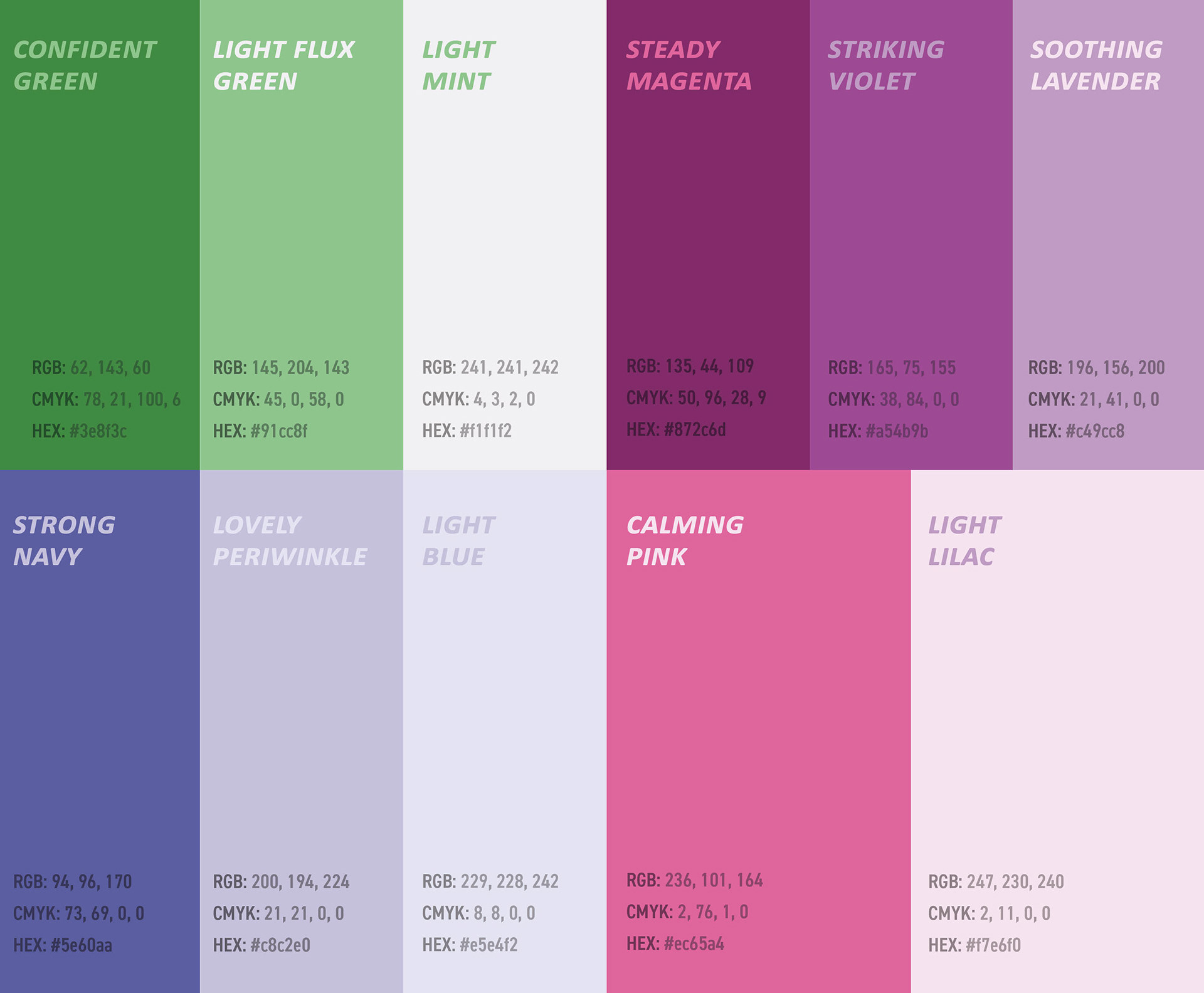
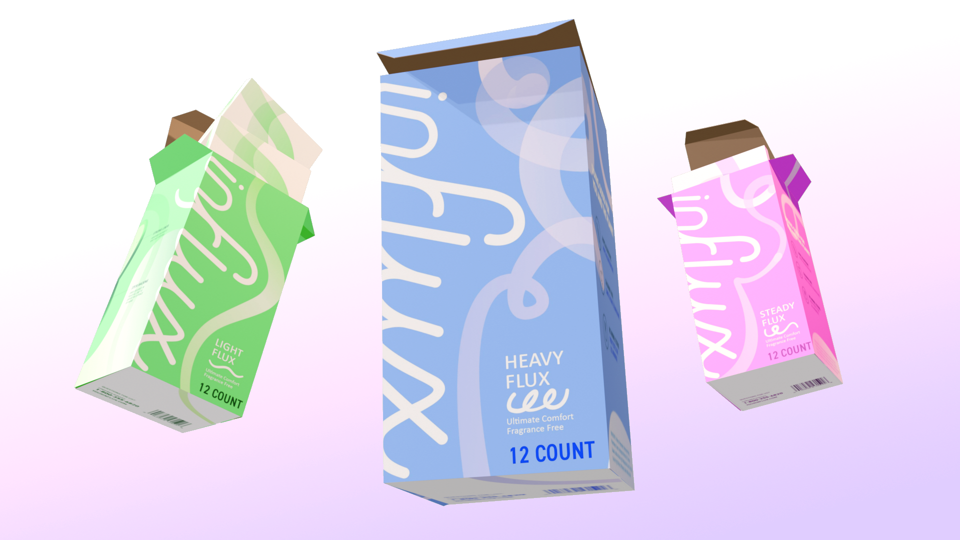
Visual Language
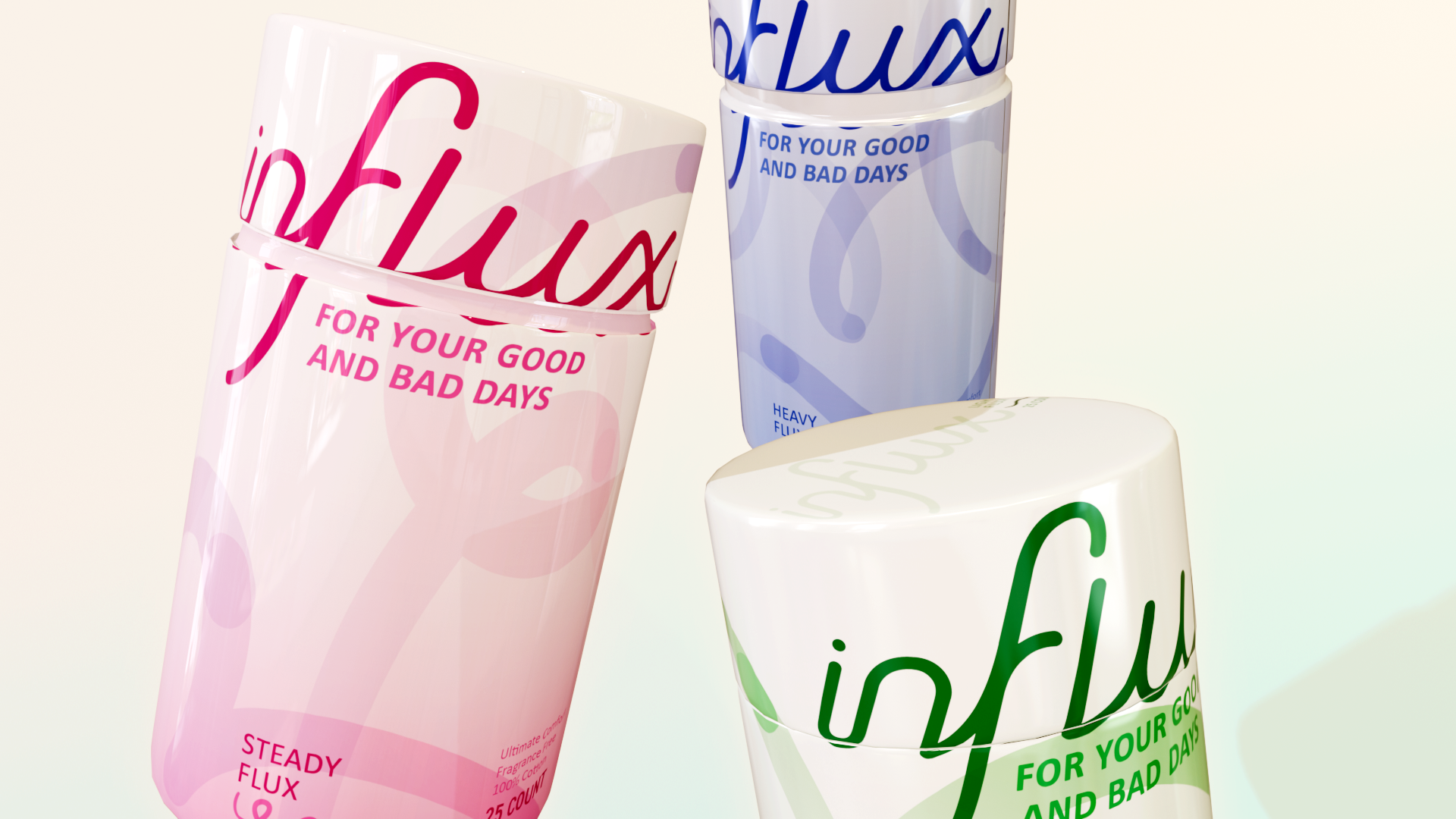
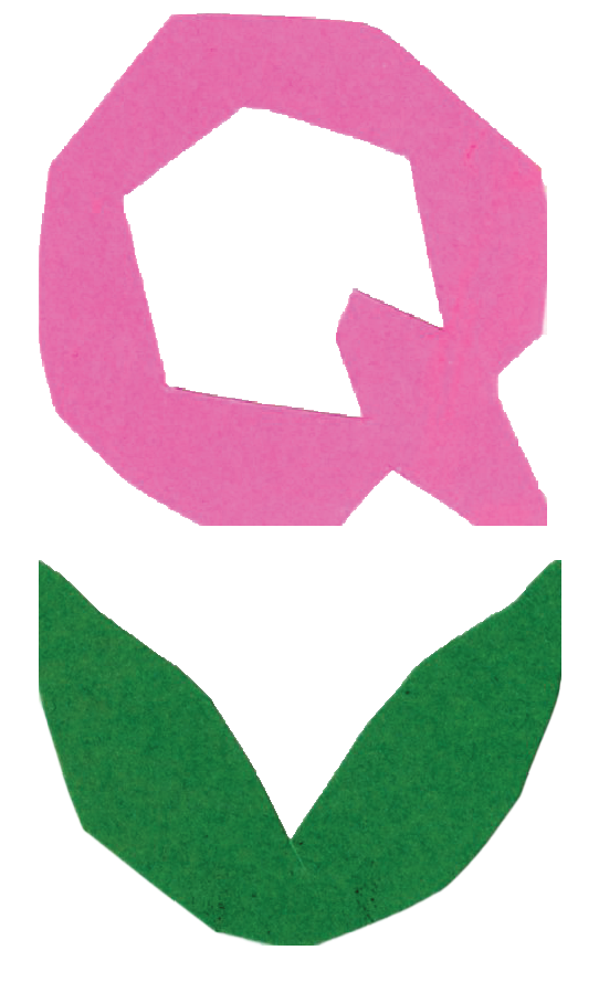
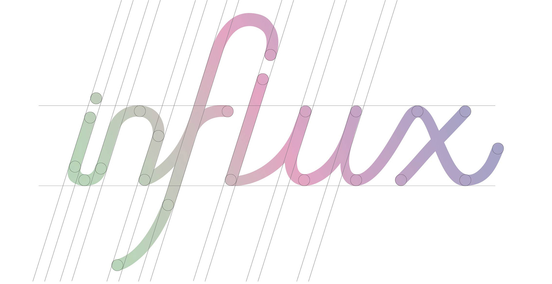
Logo Mark
INFLUX's logo is characterized by one flow with each letter continuously flowing from one end to the other. The mark is constantly "in flux", going from low points to high points, a visual representative of the experience of many.
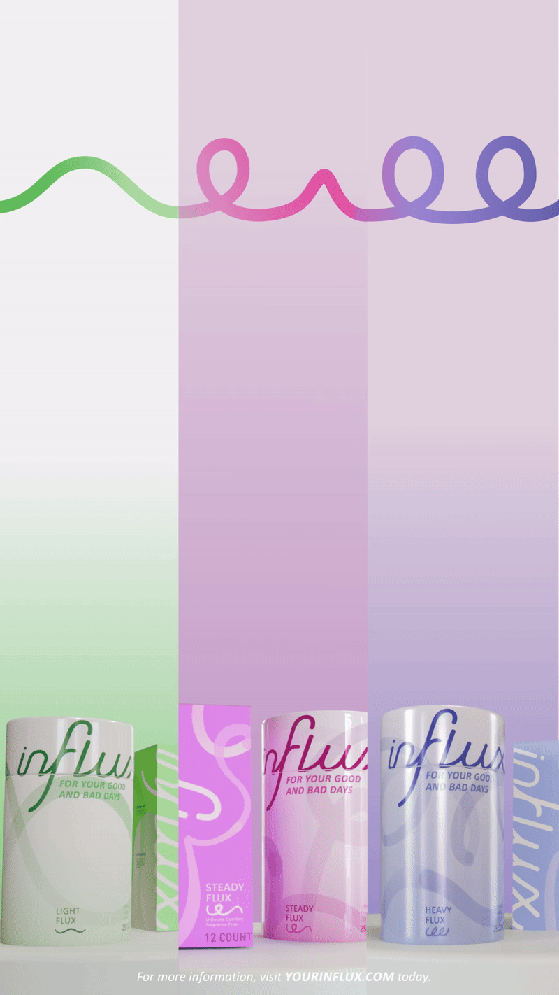
Each flow is represented by a flux, with the characteristics abstractly tied to how light or heavy a flow might be. The flux patterns may go through limited undulations or extreme ups and downs, reflecting the state of a flow.
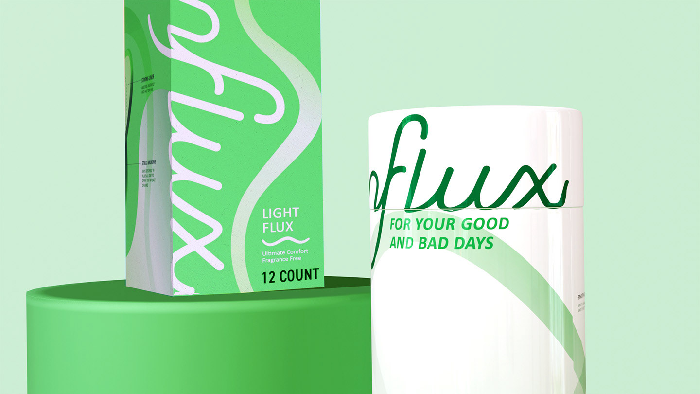
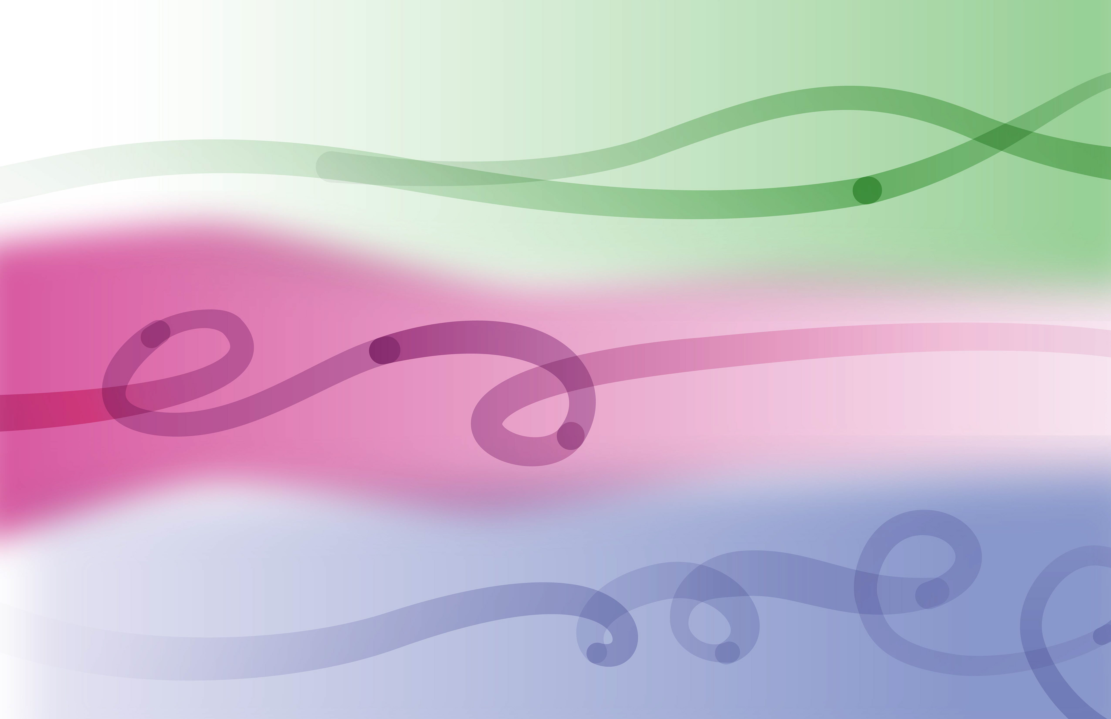
Light Flux
This flow is characterized by waves of smaller amplitudes in a limited fashion. It reflects a spotting or light stage.
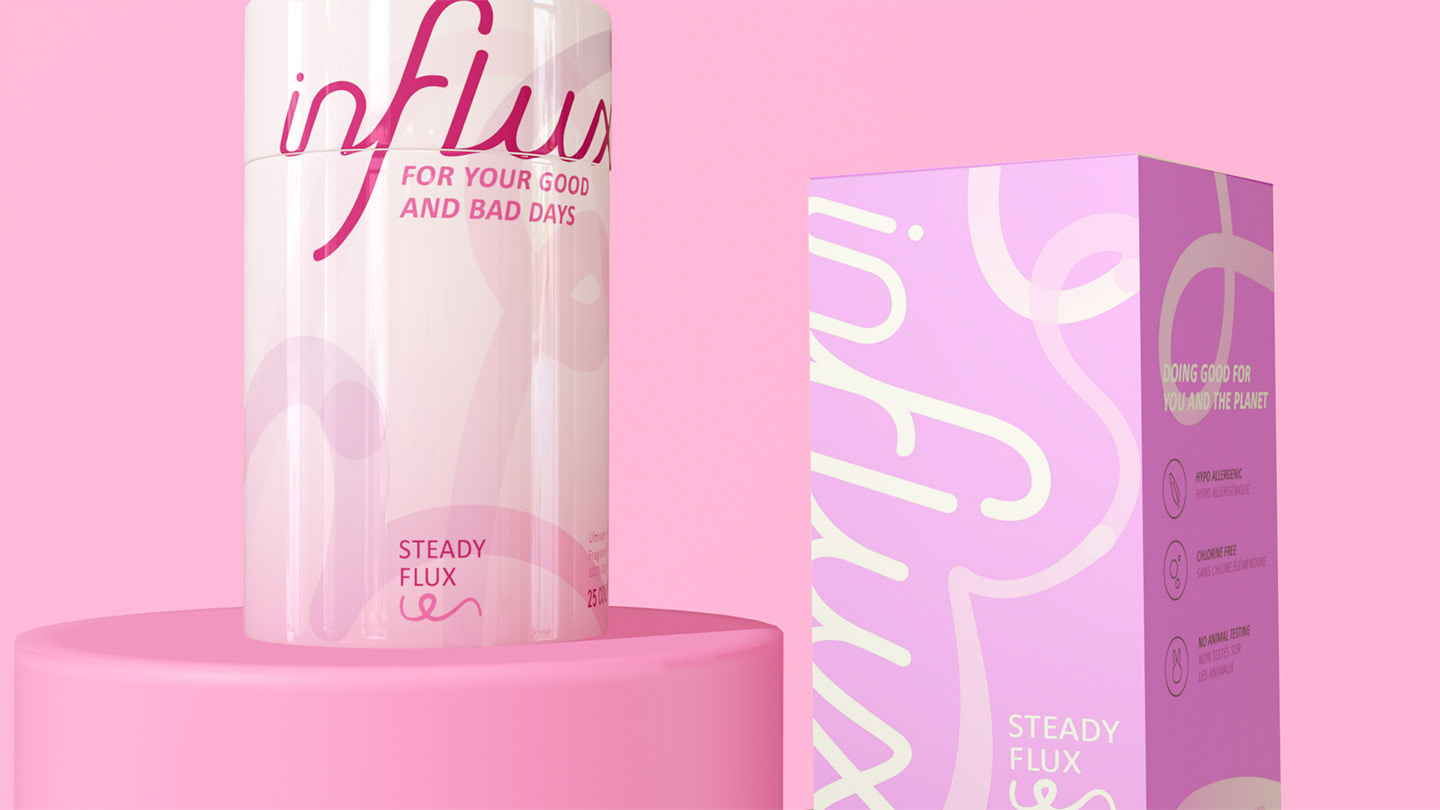
Steady Flux
This flow introduces a ups, downs, and loops into the mix as the flow increases.
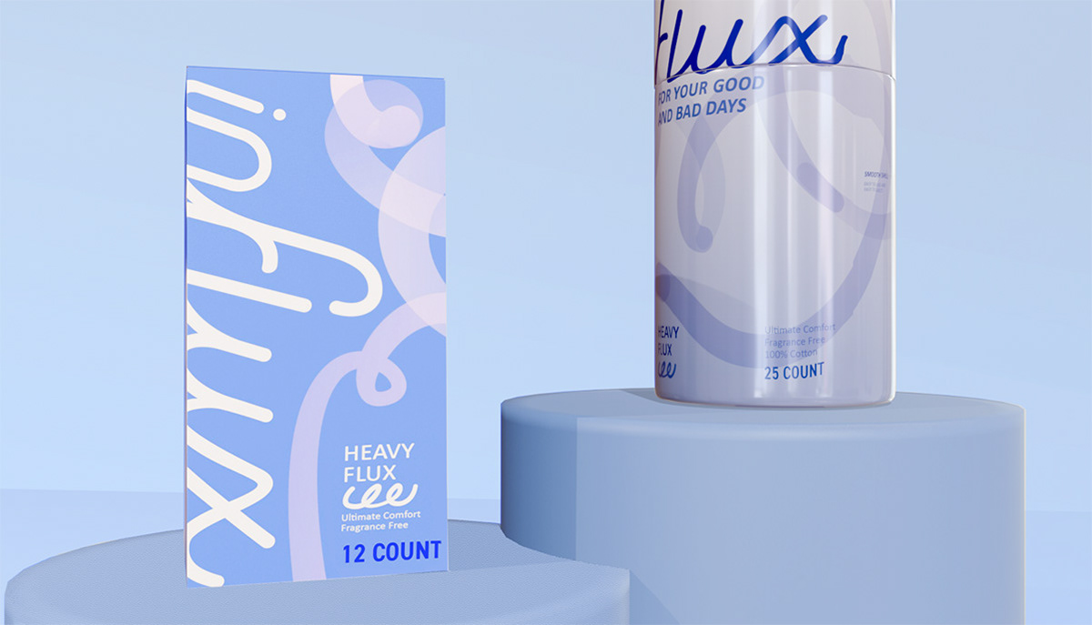
Heavy Flux
This flow sees increased curls and ups and downs. It represents the amount of a heavy flow.
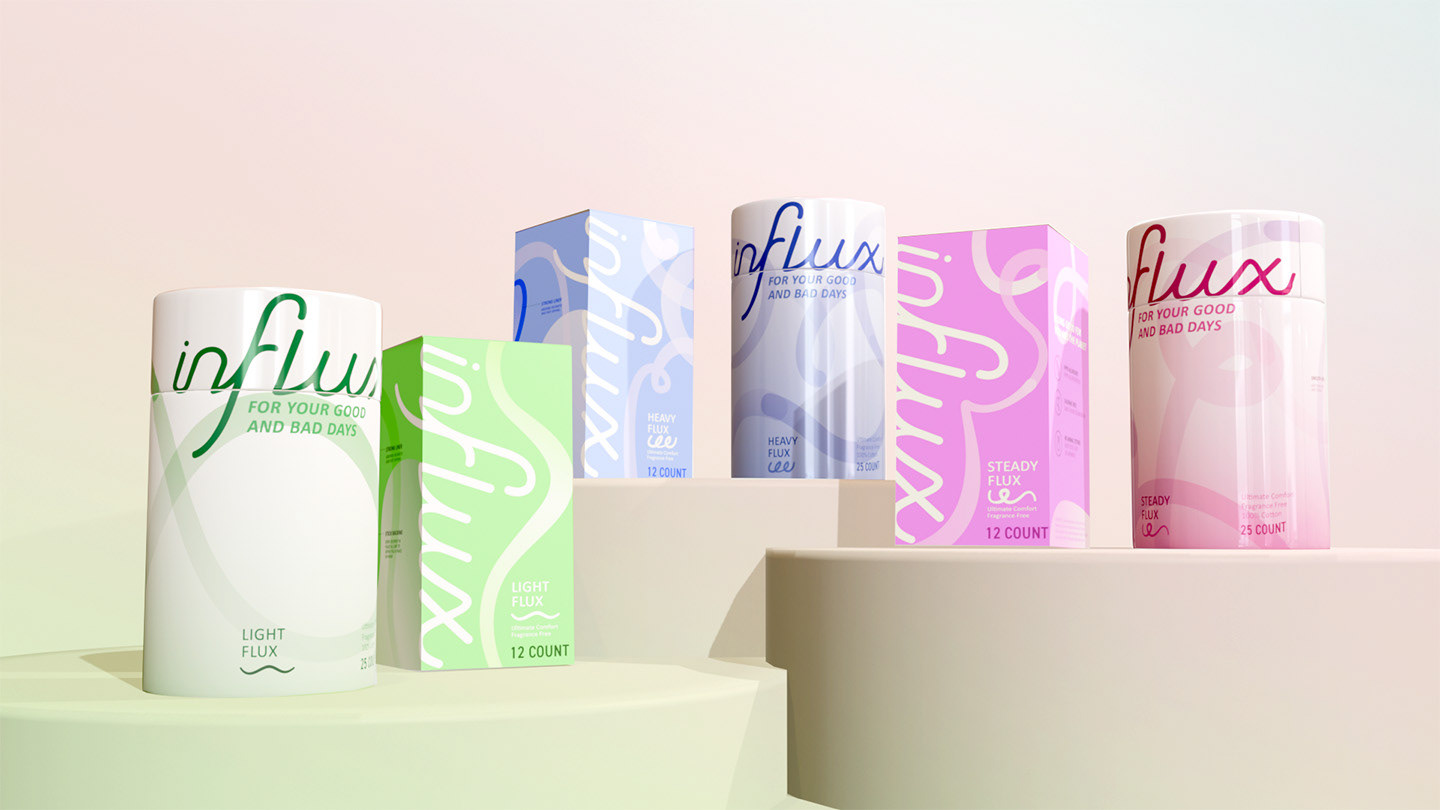
Made With You in Mind
INFLUX features 2 product versions of pads and tampons with 3 different lines: light, steady and heavy.
INFLUX re-visualizes your body’s flow and offers you a peace of mind on your good and bad days.